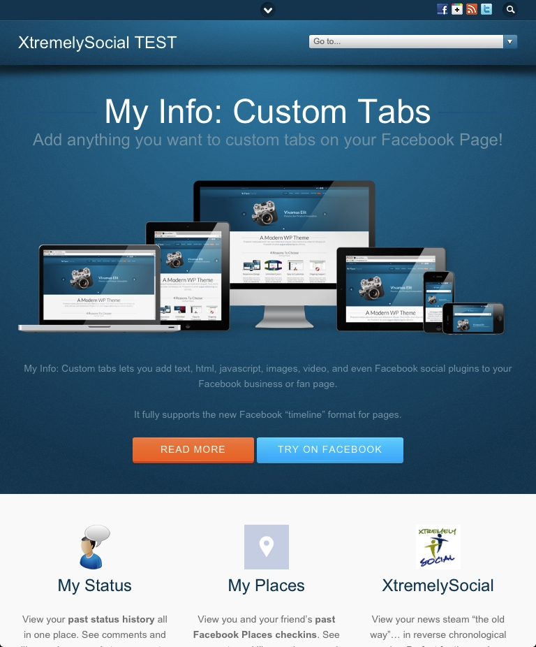
I have finally rolled out a new fully-responsive website theme that is optimized for both desktop and mobile browsing. The new site automatically reformats itself based on the width of the browser or mobile device. So it should look great whether you are accessing it with an iPhone, iPad, Android, or Windows Mobile device.
The full site content is available now on mobile devices. Previously, the full-width site would display on the iPad and a special “smartphone” theme was used for phones. That smartphone theme didn’t look similar to the full website and didn’t display all the content of the site. So the site now provides a much better experience for mobile devices, while still being optimized for desktop and laptop browsers as well.
I also wanted to provide a more modern look to the site. Sites these days are not only fully responsive, but provide a cleaner, simpler look with more “whitespace” between the various pieces of content. If you look at our home page, for example, you’ll see how its still graphically rich but a much cleaner look.
For now, I have left the top navigation, right sidebar content, and footers essentially the same as the old site. This was done intentionally so users wouldn’t be so completely disoriented by the new site design. However, over time I will be the footers and perhaps eliminating the right sidebars altogether and using the extra space to format the page content itself in two columns.
Please feel free to let us know how you like the new site. Please note that the Facebook Friends and Facebook News Stream pages are driven by our XtremelySocial app on Facebook and it hasn’t yet been optimized for mobile. However, if you run into any formatting issues with anything else on the site, please let us know.

